Plus Hosting
How we boosted sales for the leading Croatian hosting provider
Customers at every level of knowledge and skill are now able to shop for exactly what they need with greater confidence, efficiency and clarity.
User Experience / Interface Design / Web Development / CMS Implementation
User Experience
Interface Design
Web Development
CMS Implementation
Overview
- Plus Hosting is the leading web hosting solutions company in Croatia. With over 10,000 clients, it’s critical that they continually innovate their services to empower and encourage people (from the absolute beginner to the consummate professional) to harness the power of the internet.
- Plus Hosting recently recognized it was time to update their own online presence. The overall user experience needed to be updated to reflect Plus Hosting’s current standing as the industry leader in the competitive marketplace. But also, too many customers seemed to be overwhelmed and intimidated by the product selections, or confused and frustrated by the overly complicated checkout process. Both issues either meant less potential customers purchased the products at all, or, had to reach out to customer support for time-consuming assistance.

Objectives
- Plus Hosting turned to Lloyds to tackle the following challenges:
- Improve overall site aesthetic for a more engaging, friendly brand story.
- Improve overall site architecture and navigation for a stronger, easier to understand user experience.
- Drive lead generation and sales through a more conversion - focused design.
- Create a robust knowledge base to help users of all levels understand the products.
- Reduce confusion and dependence on customer service representatives.
Results & Stats
- The results are still fresh but check them out
- Bounce rate reduced by 80%
- Page views increased by 132%
- User sessions increased by 131%
- Traffic on FAQ increased by 15% which resulted in a 20% offload on customer support
- Revenue generated from mobile devices increased by 60%

Focus
- Our focus for Plus Hosting’s website redesign project was all about improving the navigation for a stronger user experience. We wanted to reduce the overwhelming, text-heavy, complicated design that seemed to confuse users enough to deter sales. But, by boosting the functionality and adding more opportunities for lateral movement between content, potential customers would be more inspired toward online conversion and less of a burden on customer service.
Style concepts
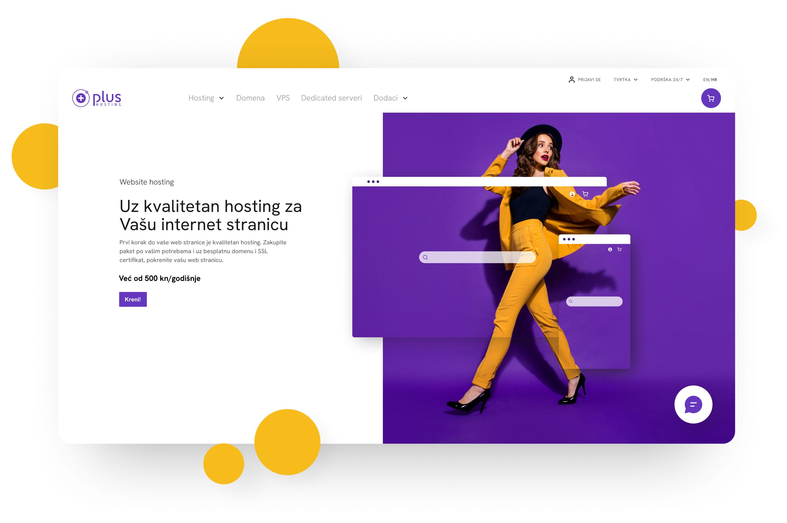
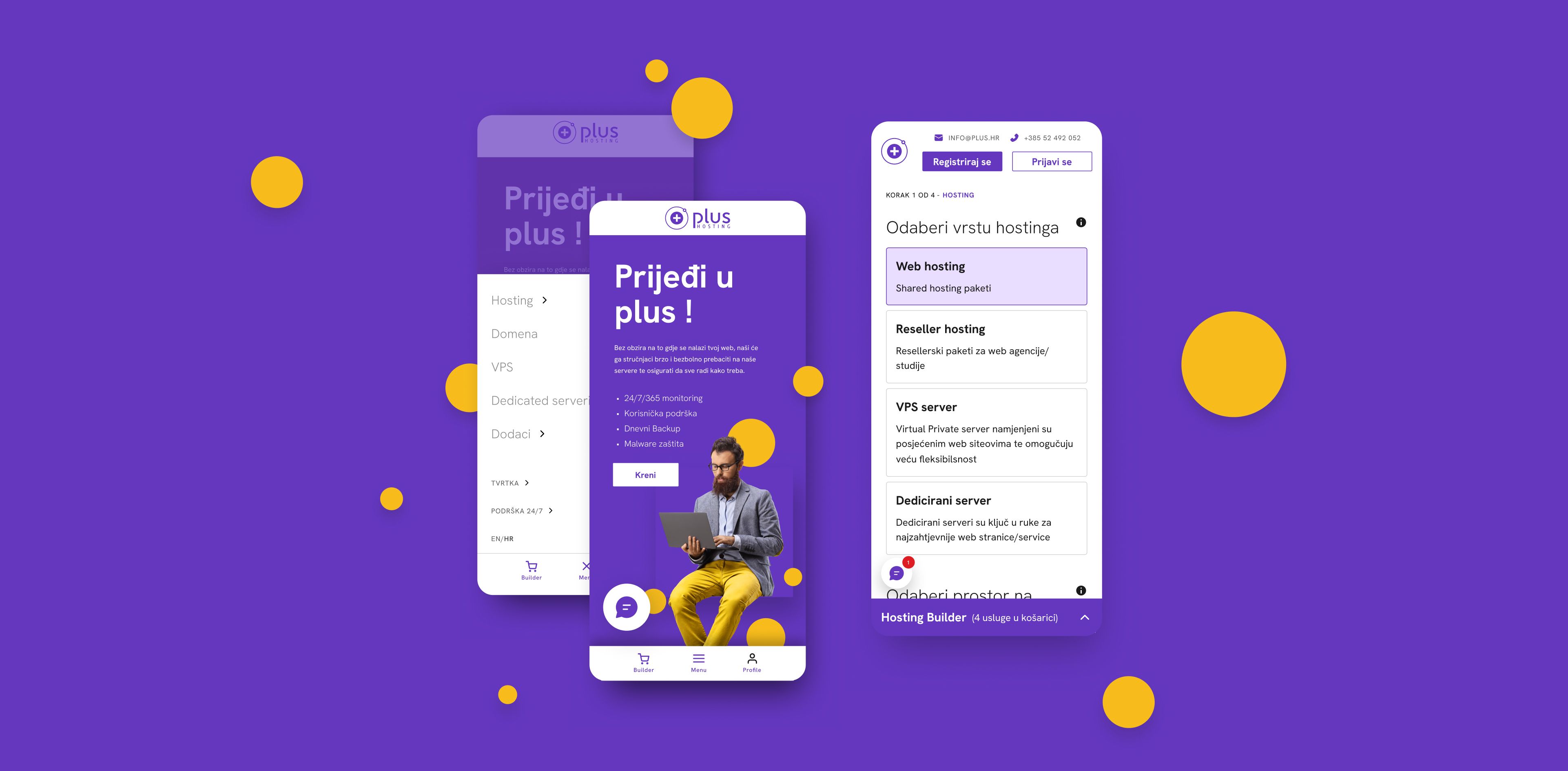
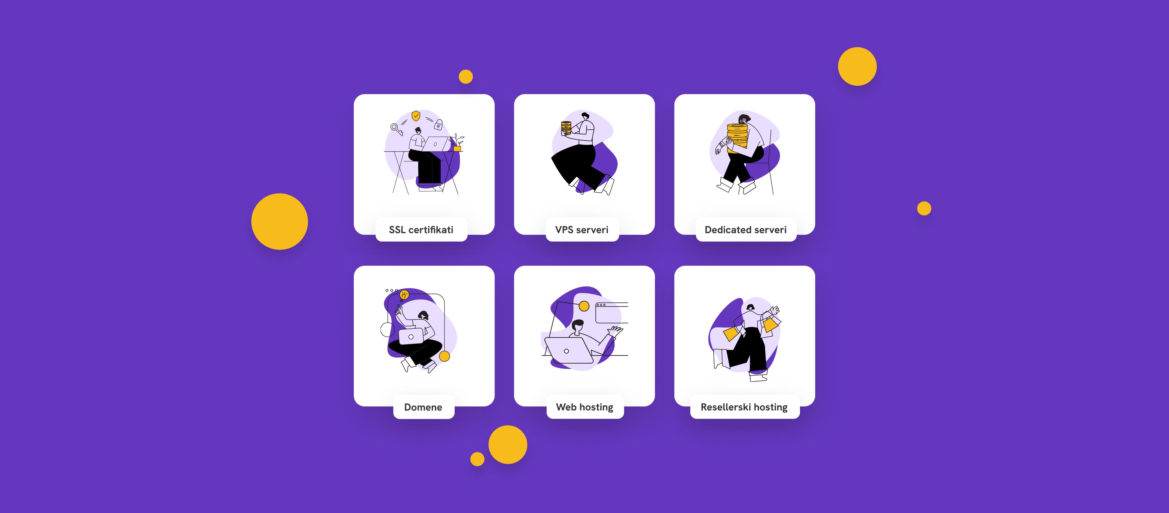
- Plus Hosting already had well-known branding, all we needed to do was jazz it up a bit. We used a palette of purple, yellow and white, creating modern characters, accents and backgrounds to give the site a fresh and fun feel. Each page now features bigger images, animated illustrations, bold, clear graphics, and more white space, creating a more inviting, relatable experience. A playful, casual, friendly visual story walks potential customers through the now-approachable, easy to understand purchase process.

Wrapping it up
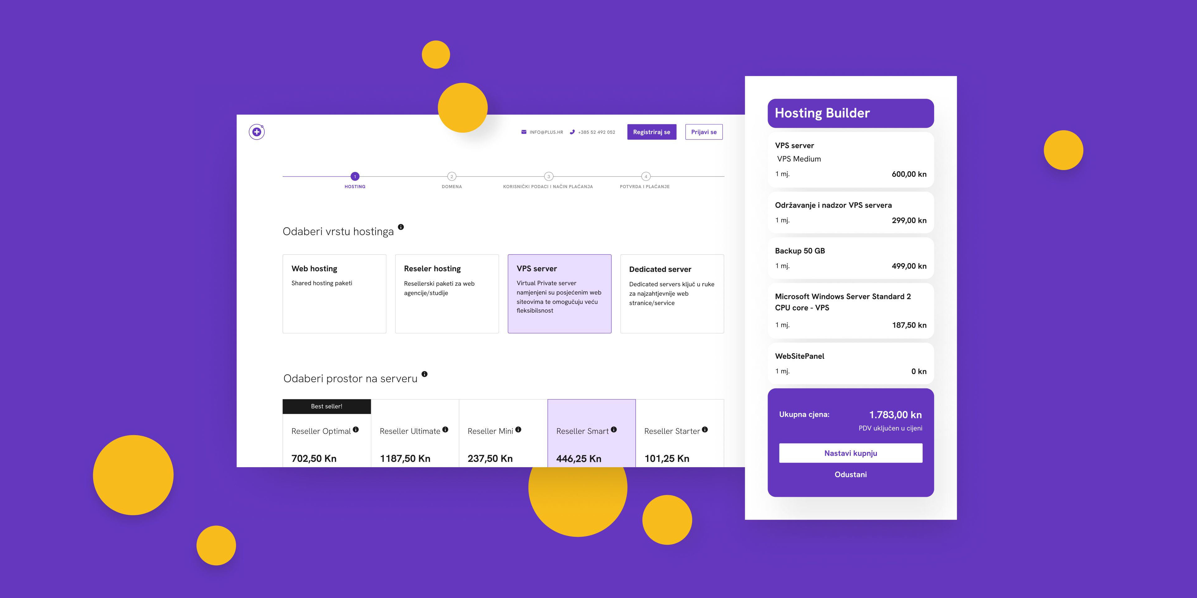
- Plus Hosting’s redesigned site NOW offers more support to the user without overloading customer service. The new “builder to end all builders” has a significantly lower shopping cart bounce rate and higher sales continue to raise revenue, brand awareness, and customer loyalty. The revamped site also ranks higher in search results, bringing in more new customers and conversions than ever before, and an overall lower site-wide bounce rate.
- Customers at every level of knowledge and skill are able to shop for exactly what they need with greater confidence, efficiency and clarity.

Next story