Meneghetti
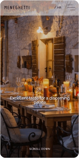
Website which communicates ‘Where nature meets luxury’
In search of a place where it is possible to enjoy elegance to the last detail, you arrive at the Adriatic oasis, the Meneghetti Wine Hotel & Winery.
User Experience / Interface Design / Website development / CMS Implementation
User Experience
Interface Design
Website development
CMS Implementation
Overview
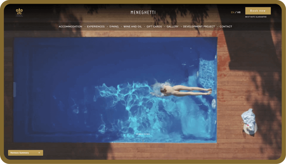
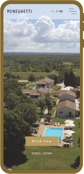
- Our client, a 5-star luxury Meneghetti Wine Hotel & Winery in Bale, Istria, approached us as they wished to redesign the website that needs to communicate ‘Where nature meets luxury‘. The old website had an emphasis on the tradition of the Meneghetti Wine Hotel & Winery, thus not showing the serenity, tranquility, and exclusivity of its hospitality services.
Project Idea
- To drive website presentational improvement, we worked collaboratively with the Director of Sales and Marketing to ensure a deep understanding of a tailored and bespoken approach to their clients, whose clientele demand the highest level of service expected from a 5-star luxury Meneghetti Wine Hotel & Winery.
Challenges
- to redesign a website that needs to communicate ‘Where nature meets luxury‘,
- to design a user-centric web,
- to describe to the end-user the complex experience from hospitality industry leaders done simple,
- emphasize the sales component,
- to deliver better user experience focused on sales,
- the breathtaking, smooth, and elegant homepage that attracts, engages, and brings visitors back.
- The challenges have one larger common link – to improve sales and processes.
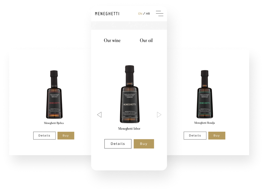
- The complex Meneghetti Wine Hotel & Winery offer from hospitality industry leaders consists of accommodation in villas, residences, rooms and suites, various experiences in fine dining, wine and oil tastings, spa & de-stress packages, various gourmet packages, business and pleasure custom events, and a fairy-tale wedding.
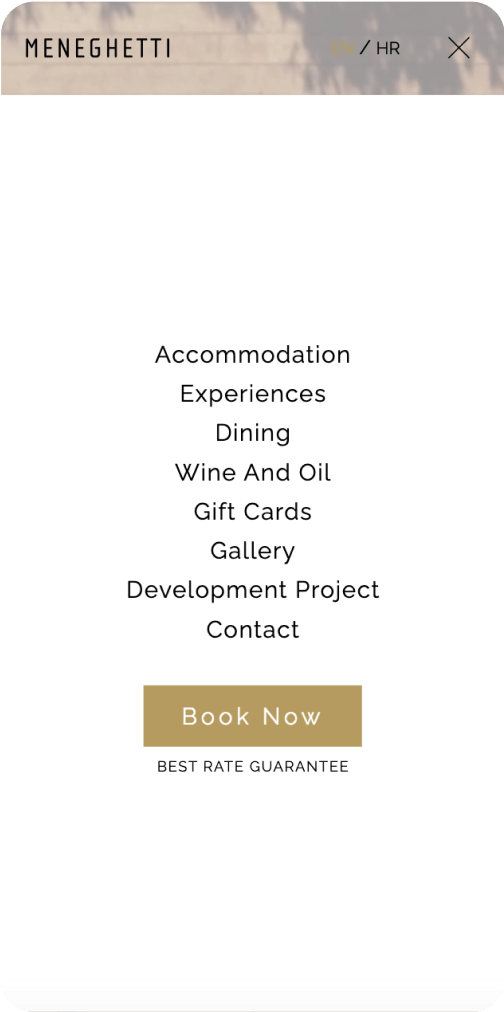
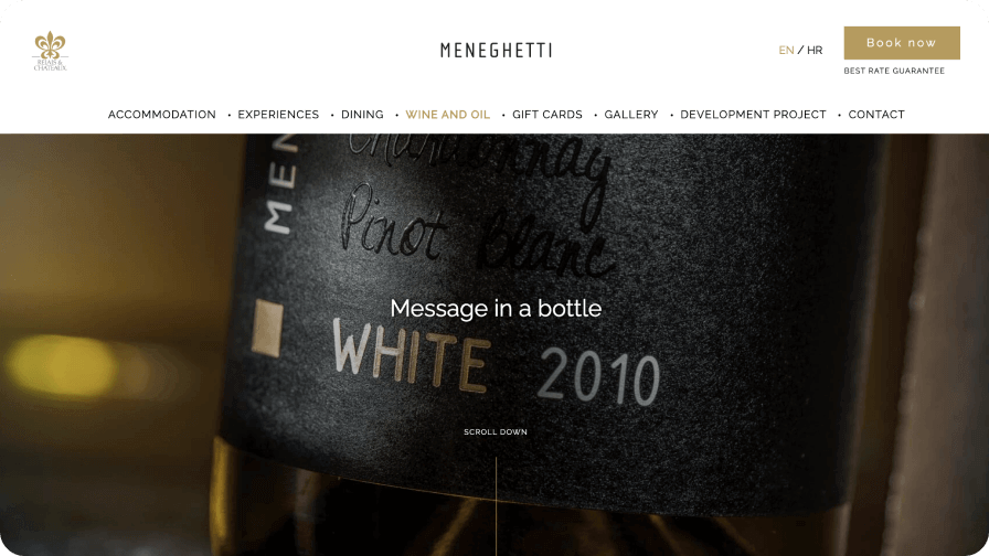
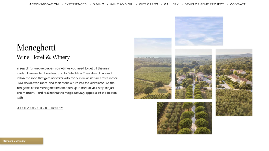
- Great collaboration with the Director of sales and marketing resulted in a comprehensive website that consolidated all luxury Meneghetti Wine Hotel & Winery offerings presented in a simple way. The website has a clear menu structure that allows users to easily navigate between pages and find the content they’re looking for.
The result
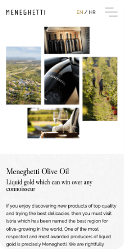
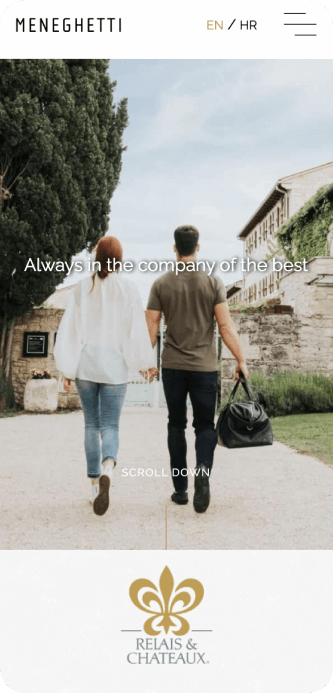
- We chose simplicity and minimalism to present a wide hospitality list in a simple easy-to-navigate way that focuses on the amazing images of Meneghetti. The whole look and feel of the website is approachable but at the same time exclusive.
- We created a beautifully-crafted, full of personality website with a video background landing page that made the website look modern and created a sense of artistry that static background images simply can’t match up to.
- Finally, sales-oriented redesign increased conversion rates by 138% which accomplished the main goal of the redesign.

Next story