Tech & Trends
30. 10. 2020
What is web accessibility adjustment and where to start? Start thinking about everybody.
I got an assignment to make accessibility adjustments to the existing project. My initial reaction was – oh, ok what exactly do I need to do? The response was vague. Well, you need to make a web page accessible for people with disabilities. Every kind of disability. Everybody needs an easy way to get to every information on the page.
”Oh, ok but tell me what I need to do exactly?” ”…well start with having a toggle button for bigger font size.”
So, I started with that …
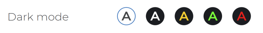
Dark mode
Next step – the latest tech design trend – dark mode. After the initial implementation of the ability to change the font size on the web page, I implemented a dark mode option. My research leads to contrast levels. How readable are the color combinations on the web page and what is the best shade of black for the background?
And now we had this cool feature that is very trending, and more and more users choose to use the dark option in their apps. Of course, our main goal in this project was to help people with various vision and eye impairments.
Finally, after the initial review from the Association of Visually Impaired People, we received a proposal to make the following combinations: white on black, yellow on black, red on black, and green on black. So the final product in the widget has the following options:
The implementation was not very difficult. In Lloyds design, we use Vue.js and Nuxt.js. Therefore, the @nuxtjs/color-mode is a great option.
Were these adjustments enough? Most of the sites have only these two options, but then I started to google more deeply.
A11Y
A11Y is something that is appearing when you start to research web accessibility. The A11Y Project is a community-driven effort to make digital accessibility easier. This is the right thing to google when starting to explore web accessibility. It refers to a global movement to make web content and computer systems more accessible.
In the beginning, it was hard finding the right resources. It was a lot of information and still, I couldn’t find the answer to what exactly I should implement into this project.
I found out it is hard to please everybody’s needs but you should at least try! The things that I learned and that I will implement (and fix) in the project are keyboard navigation adjustment, screen reader adjustment, letter-spacing change, font-size change, and of course, a readable font option.
Why is this important – who are the users?
“According to WHO, there are 285 million people worldwide who, due to some disability (i.e. they are suffering from low vision), cannot read all content on a website. 39 million of those people are blind and cannot access any of the content via sight.” https://www.sitepoint.com/how-many-users-need-accessible-websites/
I found out a lot about how many users can’t get to the information as easily as they should, considering we are in the 21st century.
The adjustment you can make as a developer
The first thing to do is to test your page navigation with the TAB key. When I started testing it, I found out I was making a big mistake in all of the projects I have ever made.
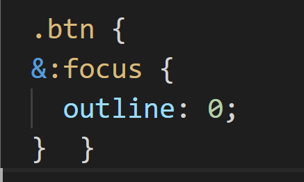
For keyboard navigation, users need to have a focus on the element they are on. This focus is, of course, not very pretty and it ruins the design concept of the page. The first thing that I did, I disabled focus on buttons. In fact, it was even disabled in my default CSS that I put in every project.
This is nicely solved with a little script I found in a blog with the title that says it all “Removing that ugly: focus ring (and keeping it too)”. This little script enables focus if the user is using TAB keys and disabling focus if the user is using the mouse.
Ok, this is solved. Let’s move on …
alt=””
The image alt attribute provides alternative information for an image. Just please write that alt, it is not just for the errors in screening, it is for the users that are using screen readers.
Also, a big mistake, if you think that an image is not important, then do not put just alt, you have to put alt=””. That is something I have seen a lot. alt=”” will tell the screen reader that it can skip that part.
Semantics, keyboard-enter
Structural, semantic HTML is the key starting point toward good accessibility practices. Use HTML Elements the way they’re intended. The best way is to research how the screen-reader user and the only-keyboard user moves on the page. Then you will understand why is that so important. For example, never use a div or span for a button when you could use a semantically meaningful button element.
If you have an element like SVG that is a call to action on your web page, then you have to give that element keyboard-enter function. In this way, a keyboard user can make that specific possible action.
Tabindex=”0”
When you already made some semantic mistakes or the design of the page makes it difficult to arrange everything in the right order, tabindex can be very helpful. If you give an element tabindex=”0″ it means that the element should be focusable in sequential keyboard navigation. If you don’t want to have a focus on the element, or you think for example the screen reader can skip this element because it will only confuse the flow of the page then use tabindex=”-1″.
Don’t use carousels
Good accessibility starts with the design. It is important to learn the fundamentals and principles behind accessible design. After your research, you will find that it is better not to use a carousel if you want to have the best accessible web page. But if I need to improve an existing project to be accessible you can put a carousel in the tabindex=”-1″ and explain the content in some other way.
aria-label
The aria-label attribute is used to define a string that labels the current element. The best example is:
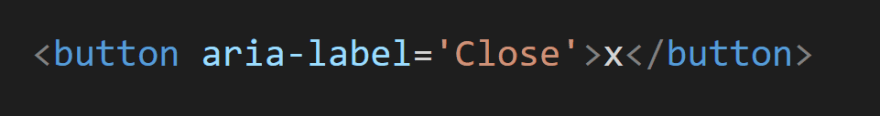
When you have an element like this, a screen reader is not going to be able to read what exactly it represents, you give it an aria-label with an explanation. Without the aria-label in this example screen reader would read “button x”, on the other hand using it in this way would be read as “button close”. We can also use aria-roles to define the different roles of elements.
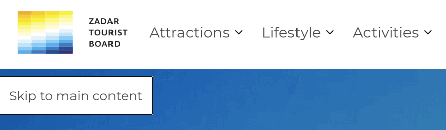
Skip navigation links
When users navigate through the page with a tab button it is good to help them with navigation. Skip links are very helpful, those are links that will be shown only to the keyboard users when they start going through the page. They will help in skipping all the links in the navigation and in going directly to the main part of that page. You can set navigation links for anything that you think will be useful for only-keyboard users.
Imagine that you have to go through all 20 links in navigation every time you enter a new subpage. Help and make skip navigation links. In my project, I have made two.
OpenDyslexic
Regarding readability, it is also important which fonts are being used. There are some widely used fonts that are more readable than others for people that have symptoms of dyslexia. OpenDyslexic is an open-sourced font created to increase the readability for readers with dyslexia.
The great implementation of the project is to give users the possibilities to read content with different fonts.
So what have I done and learned at the end?
Here you can see a final widget for the project I have been working on (Zadar Travel)
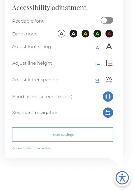
As you can see, I have implemented a toggle for changing the font to Open Dyslexic, 5 different color modes, two different font sizing, line height adjustment, letter-spacing adjustment, all preparation for screen readers users, and all adjustment for keyboard users.
It is hard to make your project perfect and accessible in the best way for people with all kinds of disabilities. But we need to try to put our best effort. I have seen that a lot of projects that have implemented web accessibility have made very small adjustments. Although this is a very positive thing, it will be more helpful for many users that we step up and do more of these adjustments.
The best way to see your project through different eyes is to test. Accessibility testing is best if you try to put yourself in somebody else’s shoes. Turn on the screen reader and close your eyes, can you find all the information you need? Use only a keyboard and see if it is easy for you or you get frustrated.
So, this is my experience and first encounter with web accessibility implementation. It is definitely easier if you try to prepare everything at the design stage of the project but you can make changes and adjustments to every existing project.
The best thing I learned is that there are so many of us and why not make everything accessible for EVERYBODY.